Golden Cross or Death Cross? How to Read 2 Powerful Market Lagging Indicators
November 25, 2025
When markets turn around the corner,
traders typically grab for signposts that can help signal to them whether
momentum is real (or if it is simply noise – fakeouts). Two of technical
analysis’ most popular indicators are the Golden Cross and Death Cross. Sure,
they may sound dramatic, but what you are really seeing is a visual cue for
identifying periods where trends are gaining or losing momentum.
Understanding Golden Cross & Death Cross as trading patterns
What’s a Golden Cross?
To understand what each one means, how they form, and how to use them in your
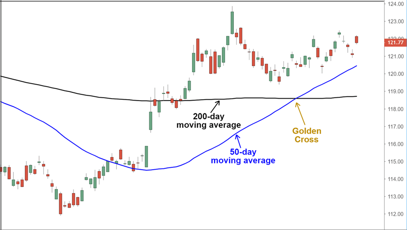
trading, lets understand first what’s a Golden Cross? A Golden Cross is
considered a bullish signal, a potential indicator that an asset price could be
entering a longer term uptrend. It happens when a short term moving average
(most likely the 50 day) crosses above a longer term moving average (usually
the 200 day).
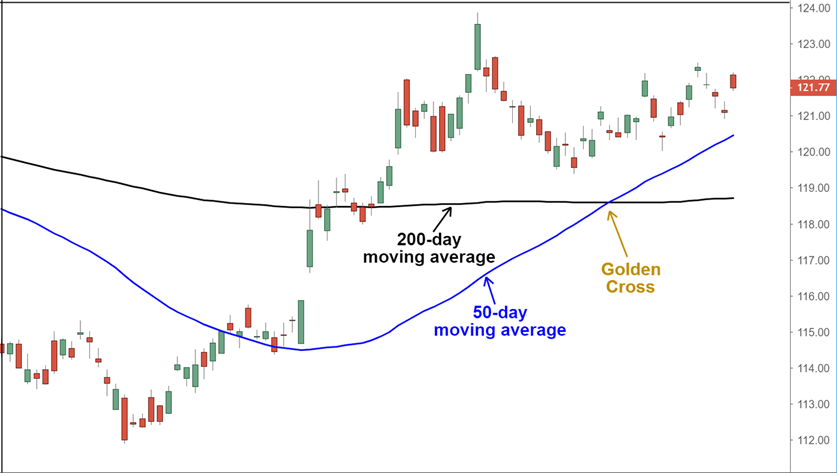
Here's a visual example:
This crossover suggests that buying
momentum is building, and many traders/ investors see it as confirmation that
market is turning positive. It’s often noticed also by an increase in volume
and a gradual shift in price structure
AKA (price action) higher highs and higher lows .
What’s a Death Cross?
While it’s called a “golden” cross for
a reason, it’s not an instant buy signal. It’s best used in combination with
other indicators, like RSI ( Relative Strength Index) or trendline breaks, to
strengthen the strategy idea and outlook.
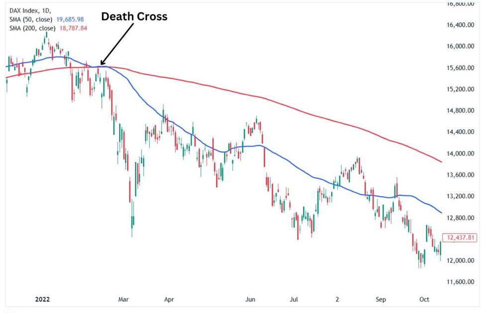
Now on the other side, the Death Cross
is a bearish signal that appears when the short term moving average crosses
below the long term one. In simple terms, it suggests that selling pressure is
outweighing buying interest, and a downtrend may likely be developing or
accelerating.
This pattern tends to form after a
significant drop, where prices try to recover but fail to hold ground. When the
faster average crosses under the slower one, it can be a sign that further
downside is ahead. It doesn’t always mean a crash is coming, but it often warns
of continued weakness or a change in overall trend.
Understanding How to Use Golden Cross Vs Death Cross Patterns in Trading
Both the Golden and Death Cross are
trend-following signals, which means they’re more useful for confirming a
trend:
- On longer timeframes like daily or weekly charts, these crossovers are
considered more reliable. They help identify the direction of the overall
trend.
- Volume can be a powerful confirmation. A crossover that
happens alongside rising volume tends to carry more weight.
- Support and resistance zones should be watched closely.
A Golden Cross near a key support may add conviction, while a Death Cross near
resistance could reinforce a bearish setup.
- Some traders adjust the moving averages depending on
their style like using 20-day and 100-day for swing trades, or 10-day and
30-day for intraday strategies.
Now, be careful, These are lagging indicators, which means they react to price, they don’t
predict it. By the time a cross occurs, part of the move may already be
underway. In sideways or
choppy markets, crossovers can produce false signals (fakeouts) or “whipsaws,”
leading to losses if traded blindly. They’re less useful in fast-moving or news-driven markets where
fundamentals override chart setups.
NVIDIA’s stock as a case study
Just look at the price action in Nvidia, for example, around March 2025.
At the time, the dreaded ‘Death Cross’ occurred and that’s just what we had in
the 50-day simple moving average slipping below the 200-day moving average – a
technical sign commonly associated with bearish momentum (see red arrow). But
only a few months later, the stock trade took off again— this time boosted not just
by sentiment in the market but strong fundamentals (earnings and
sustained demand for AI sector). This recovery was soon reflected in the charts
as Nvidia's stock formed a Golden Cross and began making fresh highs, as shown by the
green arrow.
It is a perfect reminder that moving average crossovers indeed has its
uses, but they are a lagging indicator. It shows the direction of price
movement after it has already occurred. When you see a crossover, it often
means the majority of an initial upward move may have taken place. And in cases
like Nvidia, where the company was fundamentally performing well, the technical
signal alone didn’t tell the whole story. In choppy or news driven
environments, relying solely on these patterns can lead to false signals or (fakeouts)
especially if not used alongside broader analysis.
To conclude:
Golden Cross and Death Cross patterns
are simple but effective way to assess market direction. As stated before, Golden
Cross points to growing bullish strength, while Death Cross warns of potential
declines. Alone, they’re not flawless, but when used alongside volume, momentum
indicators, and price action, they become more useful.
Rather than using these patterns as
buy or sell entry signals, think of them as for example road signs. They don’t
tell you exactly what will happen next, but they do help you understand where
the market may be heading, and whether you’re trading with or against the
trend.
Disclaimer: The content published above has been prepared by CFI for informational purposes only and should not be considered as investment advice. Any view expressed does not constitute a personal recommendation or solicitation to buy or sell. The information provided does not have regard to the specific investment objectives, financial situation, and needs of any specific person who may receive it, and is not held out as independent investment research and may have been acted upon by persons connected with CFI. Market data is derived from independent sources believed to be reliable, however, CFI makes no guarantee of its accuracy or completeness, and accepts no responsibility for any consequence of its use by recipients.





-1764065927.webp)